Showing posts with label magazines. Show all posts

Sunday, April 10, 2011

Magazines In The Spotlight... Man About Town

The relaunched Man About Town

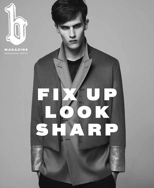
Have you noticed that there has been an incessant drumming noise over the last few weeks or so? It that has followed me wherever I've gone, there has been no escape from it. After using my Quincy M. E investigative skills to the maximum the root cause is the collective, impatient wait for the new issue of Fantastic Man. To be honest, my fingers subconsciously joined in the percussion chorus. They are even rhythmically tapping at my desk as I type this. My hands are longing to grasp the next installment of my favourite Gentleman's Style journal. The vast majority of printed men's style journalism pales in comparison. As the focus on writing quality is frequently sacrificed by more commercial demands, my interest and level of engagement with the pages diminishes. Fortunately, it isn't all doom and gloom, there have been a couple of slivers of printed style sustenance in the shape of one freshly launched magazine and one that has been given a lick of paint and a new owner. The recently launched gentleman's magazine, Dapper Dan helped fill the void as I jut couldn't put this inspiring publication down for over a week. The most recent piece of printed style sustenance came in the form of the newly relaunched Man About Town...

Pardon my French...the Paris issue.

Man About Town was first launched in 1952 by John Taylor, a former Fleet Air Arm pilot who cut his journalistic teeth on Savile Row as the long standing editor of trade journal Tailor & Cutter. The launched magazine was very much in his own image, "a magazine that helps you to be good...at being bad." Despite folding in 1967, its debonair demeanour and irreverent manner lived on. Thankfully the publication was given a breath of fresh air and became my second biannual of choice. For the sixth issue, Huw Gwyther (Managing Director of Visual Talent Ltd, the Publishers of Wonderland) proudly presents the new, improved version with the appointment of Paris based writer and editor Philip Utz at the helm. In addition to his editorship of Man About Town, Philip will be pursuing his activities as Editor-at-Large of Numéro and Numéro Homme so he is undoubtedly a journalistic force that we'll all be reading a great deal from in the coming seasons. Despite having Kickass and Nowhere Boy star, Aaron Johnson (as shot by the talented Alasdair McLellan) on the cover, the first issue overseen by the new Editorial team (Spring/Summer 2010) is a special Paris-themed edition and it is difficult not to fall for the Gallic charm. The story written over the two hundred and fifty six pages is largely about Paris and, give or take the rising English actor and odd Russian supermodel they've stuck to the plot...

One of my favourite features of the magazine has always been the Men About Town. One day I hope to see someone I know. Here we are introduced to the Frenchmen that matter including; the thinking man Sacha Sperling, the artsman Xavier Veilhan, the sportsmen Paul-Henri Mathieu and the ladiesman Melvil Poupaud.

Shirt tales with French Shirt maker Charvet. Having dressed everyone from Oscar Wilde to Oscar Niemeyer, this piece takes us on a tour of the illustrious Parisian House.

The Paris by the Book feature reminds me that it really is about time that I picked up a book again...I'm concerned that my reading age is sliding backwards.

The pages that I see myself turning back to again and again for reference is the Parisian Powerhouses feature. There's no denying that Paris is still home to some of the world's most storied fashion houses. Here, the editor knocks at the door of Balmain, Dior, Hermes and Lanvin. To be honest, I found elements of Philip Utz' questioning to be somewhat grating but overall each interview is a great read. The piece on Lanvin confirmed that I am in complete awe of Lucas.

In addition to looking at the architecture and literature of the capital we are afforded another dimension of the city by the piece on La Garde Republicaine. It is a stirring spectacle of men in uniforms.

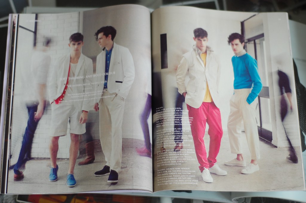
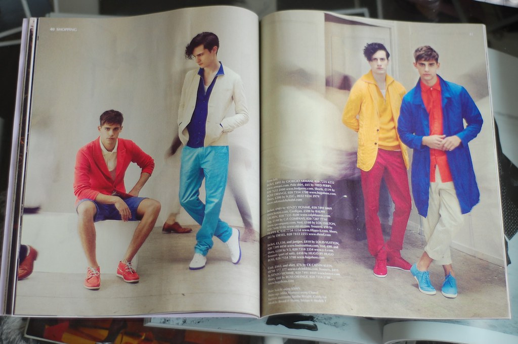
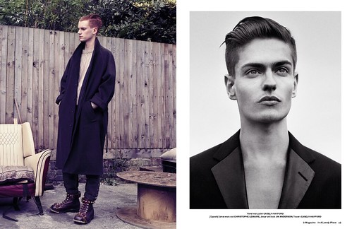
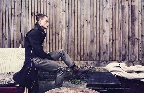
Class Act sees Willy Vanderperre and Joe McKenna combine to create my favourite editorial of the season so far. It showcases a deft combination of prep and sportswear.

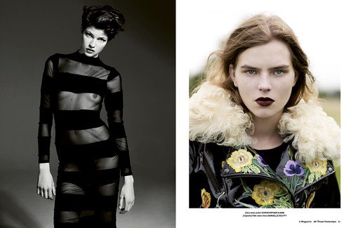
Catting Around is an editorial that I know EJ will absolutely love. Kasper Kasprzyk and Way Perry combine to create a feline friendly spread focusing on the new romantic elements of menswear.

Cry Baby, the modern day Pompadour sees Didier Malige transform Man About Town's pretty boys from a bad hair day by whipping their tresses in to pert '50s Quiffs'

Ralph Lauren might not be the most Parisian of designers but the rare interview with the man himself and accompanying spread (wonderfully styled by Simon Foxton) is most timely. The feature celebrates the opening of his sprawling thirteen thousand square foot store on Paris' Boulevard Saint Germain.

The finger tapping has momentarily subsided. The relaunched Man About Town certainly offers a welcome antidote to a great deal of mediocre men's style magazines. However, I have to confess that I have little doubt that the new Creative Director, the talented Frank Durand might just had taken a sneaky glimpse in the direction of Amsterdam when the layout was confirmed. While these pages will entertain and inspire for some time, my hands are still itching to get their hands on issue eleven of Fantastic Man.

Wednesday, March 30, 2011

Any given Sunday...

Issue nineteen of O, Diesel's Renzo Rosso graces the cover.

Is there anything better than waking up late on a Sunday morning to the aromas of a cooked breakfast and a cafetiere of quality coffee and the sights of a bright Spring morning and a crisp copy of your favourite weekend newspaper? This scenario can only be bettered by the fact that the aforementioned Sunday publication includes a copy of O, the Observer's Fashion Supplement by Tank dedicated to fashion four times a year...oh and replace Sunday with Tuesday! Ha! Issue nineteen of the well read supplement is dedicated to menswear and Spring/Summer '10. The astute amongst you will know that it came out two Sunday's ago but I'm playing catch up because I was out of the country and well, this magazine is just too good to miss. In this issue we learn that Renzo Rosso, founder of Diesel wants to build a luxury empire without the luxury bit, are reminded how one of the UK's most radical designers, Aitor Throup has ended up making the kit Englan will wear in this summer's world cup as well as listening in to a conversation with menswear designer and photographer Tamburlain Gorst. So, humour me...pour yourself a coffee, close your eyes and pretend that it is Sunday...

The stars of the season reveal their picks for the season.

In addition to offering their own essentials for the warmer months ahead including espadrilles by Paul Smith, a canvas suitcase from Pickett and aviator sunglasses from Fabris Lane, the O team ask a few of the stars of the season for their own personal picks. On such star is Marc Hare who offers his tips for hot legs this summer. Mr Hare's four picks include Mr Hare Capotes, Turnbell & Asser socks, James Long leather biker trousers and Opi nail varnish in jade. For the latter he concedes that after wearing elegant shoes every day, the aesthetic of his bare feet just wasn't cutting it so now you can tell he is Mr Hare even without the shoes. One thing is for certain, I'll be looking down at his feet next time I bump in to him.

Soft Tailoring and Bold Colour. Photography by Brendan & Brendan with Richard Pierce as Fashion Editor

The supplements contains one of the strongest editorials I have encountered so far this season. Soft Tailoring and Bold Colour does exactly what it says on the tin by dishing up the modern art of smart casual. The stills see in the magazine are actually screen grabs taken from a video which is available to view over on Because Magazine. During this video models Broed and Tristan suffered for their art by holding their poses while gallery visitors milled around in the background. For me, both the stills and video feel like a fresh spring fashion breeze.

Soft Tailoring and Bold Colour. Photography by Brendan & Brendan with Richard Pierce as Fashion Editor

One of the key fashion articles within these pages is penned by editor Peter Lyle who discusses how after a decade of seemingly mutual suspicion, high fashion and sportswear has finally got something interesting to talk about again and how he sees the new England kit as just the beginning of a rekindled relationship.

Sport and Fashion. The example of Aitor Throup

The way in which sport's influences on men's fashion surges and shrinks has always been fascinating to me and I'd love to look at the issue with a bit more historical insight one day (just add that to the list of blog topics I've been promising) but Aitor Throup certainly represents and interesting development. My thoughts on the designer are well discussed throughout this blog but it is always a pleasure to be reminded that one of the UK's most exciting design talents has ended up designing the kit that England will wear in this summer's World Cup.

The Son Also rises, Nick and John Hurt.

If my eyes were not dazzled enough by the featherlight tailoring and bold colour of the previous editorial they are then introduced with the sight of John and Nick Hurt wearing the very best of this season's heritage and workwear inspired pieces. The duo certainly dress and play the part well. The acting legend and his rising son bring a sense of real integrity and substance to the clothes.

The Son Also rises, Nick and John Hurt.

There is something dirty about lazily flicking through these pages intended for weekend eyes on a dull Tuesday but I like it. Why can't every day be Sunday and why can't every Sunday offer something as thoughtful and as varied as O?

Sunday, March 20, 2011

Weekend Reading Tip: 032c


Having complained that my blog reader had been inundated with what appeared to be two cloned posts the twentieth issue of 032c is the perfect antidote. Now, it is time to step away from the seemingly ever present and comforting glow of the computer screen and instead focus my gaze on the two hundred and sixty four pages. What began as a DIY, experiment exploring the possibilities of print has grown in to an archetypal magazine that effortlessly fuses art, culture and fashion in a lip smackingly good cocktail. The intelligence and freshness of its content is always something to savour and this issue is thankfully no different. Highlights include (deep breath) a forty page dossier on Rei Kawakubo, a closer look at Acy'teryx's efforts of pushing performance wear forward with its new line Veilance, Rem Koolhaas dicsussing Moscow's new Strelka Institute, David Simon talks anger and the American city while 032c’s latest Select presents the best of this season’s books, products, and ideas.

The twentieth issue of 032c offers welcome relief to the printed culture ennui that most of us have felt in recent years. It is the very antithesis of the quick flick through before throwaway publications that are struggling on the newstands. Now, it is time for another cup of tea and read.

Friday, March 18, 2011

Modesty of fashion

The new modesty? Club collar shirt from Unconditional.

After a long week I shunned the chance to go out and instead chose a quiet night in. In addition to catching up with a few podcasts I had a copy of Elle Collections to keep me company. You might question why I would admit to this on the pages of the blog but I'm not ashamed by it. I rather enjoyed my quiet Friday night. Now, of course this guide for Autumn Winter 2010 but I was struck by the publications diverse mix of season summation. Most biannual guides purely focus on the goings on of the catwalk by using cut outs and little else. Elle Collections manages to bring the collections and trends to life in a way that is sorely lacking in similar men's fashion publications. In addition to beautiful imagery the issue is bursting with inspiring, well written text. I could bore some of you with extracts from Germaine Greer's piece The New Age or with nuggets from both sides of the fence on the Fur Debate but it is the Five Things we love feature that really left a lasting impression on me, Mark Hooper's suggestion of Modesty in particular...

Modesty. Less flesh, more clothes, demure is the new sexy.

"In the grand scheme of things, it's probably a good thing that the British are no longer considered a nation of prudes and stiff-laced Victorian killjoys. But sometimes (usually as I'm surveying the war zone of binge drinking vulgarians on the high street of a weekend), I can't help thinking we've lost something along the way.

Like it or not, modesty is part of our national physche. Understatement is what we do best, from our tongue in cheek humour to our inclination towards tolerance over extremism. It might be something to do with the weather, we're literally mild by nature. And it used to translate to our dress sense as well. Even Beau Brummel, the archetypal 19th century dandy, preached the value of good style over peacock fashion, famously declaring of a person whose dress sense caused heads to turn, 'Then he is not well dressed.'"
Modesty as loved by Mark Hooper (editor of Electric!).

Hooper went on to describe that Brummel would have approved of this season's womenswear collections, where modesty and purism were the most buzzwords - most notably with Phoebe Philo's designs for Celine (If I were a woman I would long for Celine, hell I long for Celine as it is!). Of course, the wonderful world of menswear has always been the more conservative. Where extremes are measured in cuff lengths. The details make the difference. With the whirlwinds of fashion weeks though it can be quite easy to forget. This concept of modest but well dressed is something I will explore further this season and next. What's wrong with being a little stiff laced?

Thursday, March 17, 2011

Spring has sprung

The sun is shining folks and the ever present grey clouds are fast becoming a distant memory. I have noticed a new spring in my step as we enter a new season and it is time to shed off my protective outerwear shell and reveal a little flesh while wearing lighter, more seasonal friendly layers. In a moment of celebration over the blue skies and squint inducing sunshine I escaped my desk and headed to Hampstead Heath for a stroll in the great outdoors. Suffering from a short attention span I needed a companion as I sat on one of my favourite benches and observed the dog walkers, kite fliers and ducks so I picked up the latest issue of Monocle. I have to confess that I have recently become somewhat bored of the repeated issue blueprint and had not intended to buy the issue, however it proved to be an interesting and welcome distraction from my quiet afternoon. Highlights include an insightful overview of Pitti Uomo and a men's fashion editorial which mirrors my sartorial desires for Spring. The following eight pages see American sportswear classics and Italian tailoring refreshed and updated with an element of Japanese sharpness. The Takeharu Satu spread showcases cardigans, lightweight jackets and blazers as the ideal options for clever seasonal layering.

Left; Jacket by Beams+, shirt by Gitman Brothers, scarf by Piombo, belt by Oliver Spencer, trousers by Aspesi, shoes by Yuketen. Right; Jacket by Engineered Garments, handkerchief by Drakes London, shirt by Beams+ and bag by Church's.

Left; Cardigan by Kitsune, shirt by Post O' Allis, belt by Piombo and trousers by Polo Ralph Lauren. Right; Jacket by Corneliani, shirt by Gitman Brothers, tie by Hackett, belt by Oliver Spencer and trousers by Piombo.

Left; Jacket by Woolrich Woolen Mills, jumper by Hackett, belt by Nepenthus London and trousers by Aspesi. Right; Jacket and shirt by Engineered Garments, tank top by Nigel Cabourn, trousers by Piombo and shoes by Yuketen.

Left; Coat by Nigel Cabourn, waistcoat by Beams+, shirt by Oliver Spencer and trousers by Hackett. Right; Jacket and waistcoat by Barena, handkerchief by Drakes London, shirt by Comme des Garcons Shirt, belt by Williams for International Gallery Beams, trousers and espadrilles by Hermes.

Spring has certainly sprung and this editorial whets my style appetite...all that is needed is a daffodil in the buttonhole and the transition in to the new season will be complete.

Wednesday, March 16, 2011

Out of Print


Visionary creative director David James has fortunately (for us) decided to showcase twenty two years of innovation in a unique online exhibition. The resulting site is just too good to miss. David James' Out of Print displays plentiful highlights from his career to date while offering alternate views of articles and 'Idea Evolution' text which unravels the inspirations and concepts behind each piece. Now, you might not recognise the name but if you have picked up a fashion magazine in the last decade you would have undoubtedly admired his craft.

James is best-known, to me at least for his work at Prada (for whom he has been art director since 1997). After twelve years of iconic print campaigns James's work for Prada is now shifting towards the moving image. Even the print ad campaigns for SS10 are stills taken from Yang Fudong's utterly beautiful and fascinating 'First Spring' film. Over the next year, James is said to be repositioning his studio towards working in this medium and it seems fitting to finally celebrate his print work online. As I look through his impressive body of work and unravel the evolution of each idea, I am reminded of a recent article by Craig Mod which discusses the excitement and potential surrounding the unveiling of Apple's iPad. During these uncertain and somewhat confused times, as print splutters and digital surges, one thing is certain with visionaries like James at the creative helm, beauty will always be created and it will always move forward.

Prada Aw09. The collection was inspired by country-style clothing but had elements of the futuristic and this spread echoes it wonderfully.

Prada SS00.This was Prada's famous lady collection with designs partly inspired by Lady Diana's 80's wardrobe. The campaign was made to look like a bourgeois tv drama.

Prada SS01. Inspired by Cedric Buchet's long lens shots of people on beaches.

Prada Sport SS01.

You might be more familiar with his work for the Milan fashion house but I adore his work for two of my favourite magazines. Under his creative directorship, Another and AnotherMan magazines have been notable for their typographic experimentation and strong editorial which have been a staple component of my inspiration diet...

Another Man Issue 2. Styled by Nicola Formichetti and shot by Laurence Passera.

Another Man Issue 3. Styled by Alister Mackie and shot by Willy Vanderperre.

Another Man Issue 3. Styled by Alister Mackie and shot by Willy Vanderperre.

Another Man Issue 7. Styled by Alister Mackie and shot by Norbert Schoerner.

This online exhibition, which will come down on 15 May, is a welcome opportunity to view a beautiful body of print work. It is impossible to leave the site without being inspired or at the very least having your aesthetic appetite satisfied.

Tuesday, March 8, 2011

Fashion156 on the new fragility of menswear

Over the last few days the blanket of grey that has loomed ominously overhead for months on end was finally thrown off and my weary eyes have been greeted by that unfamiliar sight, blue skies and sunshine. Officially we are still in Winter but Spring has Sprung in my eyes and I have the daffodils from Marks & Spencer sitting proudly on my desk to prove it (and to offer a fragrant reminder). Once again the talented folks at Fashion156 have unveiled a timely editorial that has left me staring in awe, semi drunk on a head alive with inspiration. The Fragile Issue is dedicated to romanticism and offers a welcome remedy from the hard edged aesthetic we have seen so much of in recent months.

John Michael O'Sullivan pens an excellent piece titled 'The Shape Of Things To Come', where he predicts a shift away from the prevalent archetypes of masculinity to a more fluid and relaxed aesthetic of menswear. The hegemonic status of the soldier, businessman, hero, warrior, leader is shifting towards an "uncompromisingly asexual and startlingly pure archetype, a fusion of utility, ease, and poetry." For me, no designer is doing more in the evolution of this new archetype than Damir Doma. Doma is a designer following who is his own path, refusing to follow trends and instead carves out the shape of a new kind of man. Doma fuses slouchy tailoring with casual sportswear shapes with layers of beautiful fabrics that blend into a grungy uniform for the modern nomadic man. In the latest editorial Fashion156 turn to a number of my favourite designers (including Satyenkumar, Tim Soar and Casely-Hayford to demonstrate that you don't have to look too far from the SS10 collections shown right here in London last September to achieve a more fragile ensemble. The shifting constructs of masculinity and the effect it has on menswear is a subject that interests me greatly and I will certainly return to it at later date but I am conscious that I have overloaded you all with text heavy posts in recent weeks. So, for now I'd just like to gaze at Fashion156's romantic editorial which is just perfect for a bright afternoon in March...it is time to be full of the joys of (fake) Spring....

Shirt by Martine Rose.

Jacket and trousers by Satyenkumar. Shirt with sheer wrap detail by Yang Li. White shoes by Wintle.

Rain mac and shorts by Tim Soar.

Jacket, trousers and scarves tied on arms by Casely-Hayford. Shoes by Church.

Shirt, shorts, bow tie and shoes by Wintle.
-----
Photography: Fabrice Lachant. Styling: Guy Hipwell. Hair Stylist: Koji Takayanagi. Make up Artist: Sally Tooth. Production: Emma Drinnan. Styling Assistant: Luke Raymond. Models: Stuart R at Models1. Joshua O at Premier. Shot on location The Russian Club Studios.
-----

Sunday, March 6, 2011

Magazines In The Spotlight...Dapper Dan

Regular readers might have noticed that it has been six months now since our last 'Magazine In The Spotlight' post but this is not want of trying. I have been frequently and somewhat furiously finger flick my way through the racks at my local newsagents but instead have been nonchalantly flicking through them before placing them back only to walk glumly out empty handed. To be honest my heart is longing for the next installment of Fantastic Man and all other forms of printed men's style journalism pales in comparison. Fortunately, it isn't all doom and gloom though as we stumbled across a fine specimen of a gentleman's magazine, Dapper Dan. I found myself in the Parisian sunshine for two glorious days this week but with my return train trip home looming I needed to source reading material. I found myself drawn to the always busy and bustling Colette and thankfully discovered the ideal travel companion. Dapper Dan is a men's fashion and philosophy bi-annual edited by Nicholas Georgiou and Vassilis Kardis and backed up by a team of talented contributors including one of my favourite bloggers, Filep Motwary.

We believe that a man’s style is something that derives from his own personality, not from ephemeral “trends”. We enjoy opinionated men. Men with a sense of purpose and a soul. Smart, intelligent and creative; Men with ideas and ideology. Men who are their own men, who don’t fit others’ standards. Dapper Dan Manifesto

Spring/Summer 10 sees the first issue of Dapper Dan. The title might be found lacking for some but the contents more than make up for this notion as the pages entertained me for my entire Eurostar journey home and I am still eager to flick through those pages the morning after. Aesthetically it is difficult not to think of the obvious influences of Fantastic Man but this is no bad thing, the magazine simply doffs its cap to one of the solitary beacons of men's style journalism. The content is undoubtedly its own and the first issue proves to be a wonderful read. The articles are varied enough to keep even the most wandering of minds focused and inspired. Your eyes are drawn to Reiner Zimmick's illustrated book Drummers of Dreams, the next moment you are reading a Filep Motwary interview with Juergen Teller, the next learning about the self proclaimed multimedia in a box magazine Aspen, quickly followed by the work of Marc Le Bihan before being treated to a number of strong editorials...

From the Various Voices editorial by Vassilis Karidis. The shifu vest

The highlight of them all has to be a spread that uses clothes that date back to the early part of the Edo period in seventeenth century Japan. The garments are made out of paper using two methods, shifu and kamiko. Alongside the images the article explains the history of these breathtaking pieces. Shifu clothes are made out of paper that is cut in to thin strips, twisted in to strips, twisted in to compact threads and then woven in "fabric." The process was developed by the impoverished rural population of the fourteenth century but it was not long before the upper classes noticed this textile and the Japanese warrior elite, the Samurai, refined the technique further.

The shifu vest would be worn as the first layer of clothing, directly against the skin.

The almost forgotten history of this unusual textile was rediscovered by ATOPOS while the organisation was researching for its 2007 exhibition, RRRIPP!! Paper Fashion. To look at the garments know it blows my mind to contemplate the avante-garde nature of these four hundred year old designs. They should make us consider anew the possibilities of raw materials, eco design and contemporary haute couture. We can undoubtedly move forward by researching further in to the histories of diverse cultures and by rethinking even the most basic materials that surround us today.

The Kamiko cape would have been worn by porters to cover the parcels on their back. It fans out to cover large packages, while the back bears the emblem of the patron.

Filep Motwary pops up again to interview one of the shining lights of men's fashion design, Damir Doma. Doma is a designer following his own path, refusing to follow trends and instead carves out the shape of a new kind of man. Under Raf Simons' mentorship, Doma was encouraged to develop an intensely personal vision of masculinity; for him, fashion design is a means of exploring the fragile nature of the body. He showed his first menswear collection in 2007 and has just unveiled his first womenswear line this week in Paris. He concedes that his eponymous label has never really aimed for commercial success, for him it is a 'huge art project.' This art project has certainly proven to be a success and I'm looking forward to watch this designer develop of both fronts.

An editorial accompanied the Damir Doma interview.

Regular readers will know that I am a huge fanboy of Lucas Ossendrijver so I was pleased to read an interview with the visionary behind Lanvin's menswear. He has managed to maintain an outsiders' perspective on fashion despite being at the forefront of the industry so I strive to learn more about the man. "Fashion can be a means of escape, to be somebody else or simply a way to dream. At Lanvin we try to be as open - as non-exclusive - as possible. For me, Lanvin is first and foremost a state of mind. I want our men's stores to be seen as a luxury supermarket, with a bit of everything for everyone, no matter their body type."

An editorial accompanied the Lucas Ossendrijver interview, all clothes Lanvin of course.

During the last twelve months (if not longer now) there have been a number of ominous grey clouds hovering over an industry struggling against an economic downturn induced advertising slump and a general state of publishing soul searching. When a new publication like Dapper Dan is released it restores your faith in printed media. The magazine is currently only available in Paris but global stockists are expected very soon so you shouldn't have to wait too long before getting your grubby mitts on your own copy. If you simply can't wait, take my advice and order online at Colette.

Spread from the Island of the day before editorial by Vassilis Karidis.

Sunday Morning Companions

IMG_7825

This scene is pretty close to my perfect Sunday morning. A quick stroll to the shops in search of a fresh out of the oven almond croissant to accompany a freshly brewed post of coffee and a hot off the press men's magazine. A great deal has been said on the recently launched quarterly publication, Port, so at this point I just want to enjoy the read. I hope you have rubbed the sleep from your eyes and are enjoying this Sunday morning as much as I am.

Friday, March 4, 2011

Preview of b three

As readers of this blog you should all know by now that London’s b store has long been a mecca for contemporary design. Whilst nurturing some of the best menswear design talent in the capital and beyond, b store have been merging art, fashion and design seamlessly for a number of years now. With each visit to the Savile Row institution, there is the chance to discover a new designer, an exhibition, a magazine or even just a moment when you talk to them and leave with something new. You can always expect to be surprised when you visit the store. Though undeniably a stylish haunt, it has always been more than just a physical space and has certainly offered more than mere fashion. It was therefore, a natural evolution of the brand to venture in to print and thankfully b magazine reflects the energy of the brand beautifully. We have been fans the moment our eager hands grasped the first issue back in September 2009. Created by b clothing’s Creative Director Jason Hughes and Editor Dal Chodha, the magazine exposes the wider b Store ethos; passion in design and integrity in individuality with a knowing nod to more sartorial affairs.

It sells ideas and it sells information. Editorially driven, b magazine looks at creatives from a wonderfully unique angle. The world it weaves through and explores means that this is a publication that is nigh on impossible to put down. It concerns itself with what they are reading, rather than what they are wearing and worries more about familiarity than fantasy. To mark the imminent release of the issue three (Monday 8th November) which includes insightful pieces on BLESS and Stephan Schneider, we caught up with both of its creators to discuss the issue over a cup of coffee and a cinnamon bun. What follows is our meandering conversation and a sneak peek inside the issue...

The cover of issue three.

SS: The magazine feels like a natural evolution of the b brand on to printed paper as it exposes the wider b-Store ethos. What were your inspirations, your dreams and the driving catalyst behind b magazine?
Jason Hughes: I've been working with both Matthew (Murphy) and Kirk (Beattie) from the very first collection and even before that point I worked with Carola Euler who was stocked at the store, so I've known the store and the guys for some time now. We had a very casual conversation about the magazine with them, Dal and myself were clear that there were certain things that we wanted to do and certain things that we didn't want to do. Primarily, we did not want it to be another fashion title because we both felt that there already were enough titles out there, some of which were doing it very well, some doing it not so well. It was very important to us that we were crating a magazine that came from an alternative point of view to anything already out there. We talked to Matt and Kirk about the store; the designers they stocked, the people who shop there or those involved in the store in some way, be that artists who have shown in store or creatives who they have collaborated with in some way and at this point we realised that this was more than a lifestyle. We described it as a world, the bstore world. This notion was of the main catalysts for the magazine. We were excited by how vibrant the b world was, not just in terms of the label or the clothes but the people which inhabited it. More than that though, this pool was a massive source of content for us.


SS: By the very nature of the store, the magazine is much more than an in store publication...
Dal Chodha: In a way it felt like an untapped pool of content. Such amazing people that come in either to shop or interact with it in some capacity.
Jason Hughes: Hopefully the magazine reflects the energy of the store. You can always expect to be surprised when you visit the store, there is going to a new designers, exhibition, magazine in the book corner or even just a moment when you talk to them. The store has always been about the new and I've always admired it for that. Matt and Kirk have always put themselves out there to discover a new designer and to support them, some of whom they have continued to support and some might have fallen off but they've always had a strong relationship with them and grown with them. I've always admired their ability to discover and nurture and this certainly fed in to the publication. At no point did we want this to be an in store magazine but rather, we have always wanted to create a lifestyle publication. Welcome to our world, it is an exciting place.

Unclassified. Welcome to the world of BLESS. Words by Ben Purdue, photography by Franck Sauvaire with Jane Howard as fashion editor.

SS: What was the starting point for the third issue? How did it evolve?
Dal Chodha: It is important for us to offer something that our readers cannot get anywhere else. The research aspect for each issue is the hardest part because we discuss topics that you can only know if you have a personal relationship with the people involved. For example, with regard to the collectors feature in this issue there is no way that your average pr would have that type of information. There is a natural progression from the last issue. We discussed the last issue and ideas on where we would like to take it, areas that we'd like to explore and expand on and this is particularly true within the articles.
Jason Hughes: We tend to have a lot of ideas and there is only a certain you can actually cover in one issue without it becoming repetitive.
Dal Chodha: We are friends as well, so outside of the magazine we share a great deal. We both have folders on our desktops as all of us do of ideas that have captured our imagination so when we meet we both discuss what we have found. For me, my main focus in the features is to talk about people that haven't been exposed in the way they deserve.

B for Baracuta. The SS11 collaboration is previewed. Words by Dal Chodha, Photography by Laurence Ellis with Jason Hughes as Fashion Editor.

SS: I have really enjoyed the recent designer features, Chrishophe Lemaire in the last issue and now Stephan Schneider. These are names people might be familiar with but your features bring them to life. I have to confess that I knew very little about Christophe before his stunning AW09 collection, that collection really made me take notice of his work. So your feature was extremely well timed...
Dal Chodha: Exactly, we've taken this ethos from bstore really. To highlight brands that people in the know, know about but our job is to promote them in a way that is fitting of their talents. We want to take them and elevate them as much as we can. Christophe's work for example is amazing but not enough people know about him or his work.

Stephan Schneider. In conversation with. Words by Dal Chodha and photography by Stefan Heinrichs.

SS: I found it interesting to observe the knock on effect of your feature on Christophe Lemaire. Quite a few publications and websites featured him following your issue launch. He was now on the radar, of course his appointment of Hermes magnified this even further...
Jason Hughes: The Hermes appointment was amazing timing really. We knew nothing about it at the time, neither did Matt.
Dal: It was announced three weeks after I met him in Paris. Of course he would have known but it wasn't mentioned during the course of our discussion.
Jason Hughes: It was really interesting when Tim featured him on style.com and did a review of the show. I think that was partly because of the last issue as well. For us, it felt like the right time to introduce him to a wider circle.
Dal: Both Christophe and Stephan have been in the industry for many, many years and that for us, is an important aspect of fashion. It is, after all a business as well as being inspirational. These guys have built solid foundations for selling clothes.
Jason Hughes: The designers that we feature and shoot are ones that tend not to tackle ephemeral trends and both Christophe and Stephan have certainly shied away from this aspect of fashion. They are much more interested in creating a highly distinct style and in cultivating collection upon collection.

The Collectors. b meets four collectors and discovers the UK's largest collection of vintage Hawaiian ukuleles along the way. Words by Dal Chodha and photography by Clare Shilland.

SS: Within the issue you introduce four collectors and their carefully curated obsessions, including Fraser Moss' vinyl and Katie Hillier's Tim Burton toys. Are either of you collectors?
Jason Hughes: Only obvious things but nothing that specific.
Dal Chodha: Me neither but I think that is what attracted us to this feature even more. It really was a nightmare to research because people kept coming back with "I collect magazines and these inspire my collection' but we wanted to go deeper and unearth a selection of unusual collections.
Jason Hughes: I've always been interested in people that have obsessions. The feature actually began when we had a discussion about fans, from fans of bands to Japanese girls who hoard Chanel bags, this then evolved in to people who obsessively collect things. it is amazing to love something so much. I think Katie's obsession with Tim Burton toys is the most fascinating, she even talks about how the toys inspire her and when she is stuck for a colour palette she goes to her toys, for me that is just genius.
Dal Chodha: These types of features are always so intimate and enjoyable to work on. Clare (Shilland) and I went to each of their houses and you can't help but become enamored with their collections. These people tend not to be asked about these passions.
Jason Hughes: I've always liked the feeling of when you think you know somebody but then discover what is behind that. It is always very interesting, what is behind this hardcore fashion person.

Furniture. Meet the future of furniture design. Words by Lewis Chong and photography by Retts Wood.

SS: Looking back over the issue now, is the collectors feature your highlight?
Jason Hughes: Actually, I really enjoyed the furniture article. For both of us it is a real highlight of the issue and it was borne out of a conversation with Matt, both of us are interested in furniture design, and we began this quest to find the new furniture designers. It was a lengthy process that went on for months but we are so pleased with the results.

In A Lonely Place. Photography by Nicholai Fischer with Jason Hughes as Fashion Editor.

SS: Despite my obvious love of digital media, I have enjoyed a love affair with printed fashion journalism for many years. What were the magazines that you just had to buy each month, quarterly or biannually? Are there any today that still excite and inspire you?
Jason Hughes: Funnily enough, if I were to be obsessive about anything it would be with magazines. I grew up in the 90s idolising magazines like iD and The Face. I'm from a small village in Wales and these magazines acted as escapism but they also informed me and opened my eyes to lots of things. Some of that has had a lasting legacy on me. There was a point in time when they were barometeres of style but times have changed. Now, I like lots of smaller, independent magazines, similar to those that Matt likes actually. The ones that have a distinct personality and are quite niche, obsessive about their subject matter. Aparamento is a great example, so inspiring. The layout is interesting, the people thy feature and their whole perspective of the home is very interesting. It is an antidote to Homes & Garden. I also love 032c, it is one of the only magazines that has been able to successfully merge disciplines of art, design and fashion.
Dal Chodha: I have quite a romantic vision of magazines. I like having to sit and stop and taking time out and magazines should slow people down. I'm not particularly loyal to any title.
Jason Hughes: It is important for me that there is something to read in the magazine, it isn't just a . There should be well written features that are informative and exciting to read. There has to be a balance.

All Those Yester Days. Photography by Willem Jaspert and Sam Ranger as Fashion Editor.


SS: There is certainly that balance in b. How do you see the publication developing in the issues ahead?
Dal Chodha: Thank you. We are really pleased with the balance and we will continue along the same path in future issues. We always have so many feature ideas but for us it important not to overload the reader with information. A magazine should be able to be consumed relatively easily, we just want to create something that can be enjoyed and kept for reference.

In A Lonely Place. Photography by Nicholai Fischer with Jason Hughes as Fashion Editor. .
_____________

In the tricky world of magazine publishing, b Magazine offers a welcome antidote to the over saturation of information on the market, which has led to a dilution of intelligent and informed journalism. It challenges the way we consume, interspersing inspired wisdom with intuitive photography within the traditional format of a fashion and lifestyle title. I'm without doubt that your coffee table or book shelf will be a better place with the addition of this publication so please do pick up a copy next week.